
Data visualization is a technique used many years earlier, and first document data visualization can be traced back to 1160 BC. Data visualization is the graphical representation of information and data. This information and data is represented using visual elements like charts, graphs, and maps. In the present world, data visualization are important to analyze massive amounts of information and make a data-driven decision.
Everyone one is looking forward to colors and patterns, and that is the main attraction of data visualization. Imagine, you are given a spreadsheet full of data, you may be feeling bored. But how about a pie diagram or a chart which incorporates the same data which was given in a spreadsheet, that is far interesting, right? In the case of customers, data visualization helps guide them through sales funnel. As you know these tools helps to demonstrate the upside of a product or service. When you have a powerful data visualization it automatically translates into sales. It also saves your time when compared with data as such.
As you can see, marketers are trusting more and more on data visualization to make adjustments to campaigns. Visual analytics give an insight into how a campaign is progressing. By checking these data visualization, a marketer can understand whether their campaigns is trending or not and that too without taking much of an effort. An effective data visualization is a delicate balancing act between form and function. If you come up with a good data visualization then as a marketer you get a good story to tell the world about what you do.
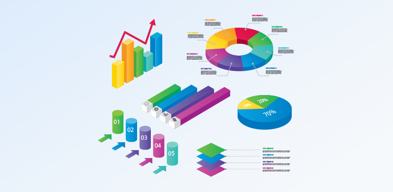
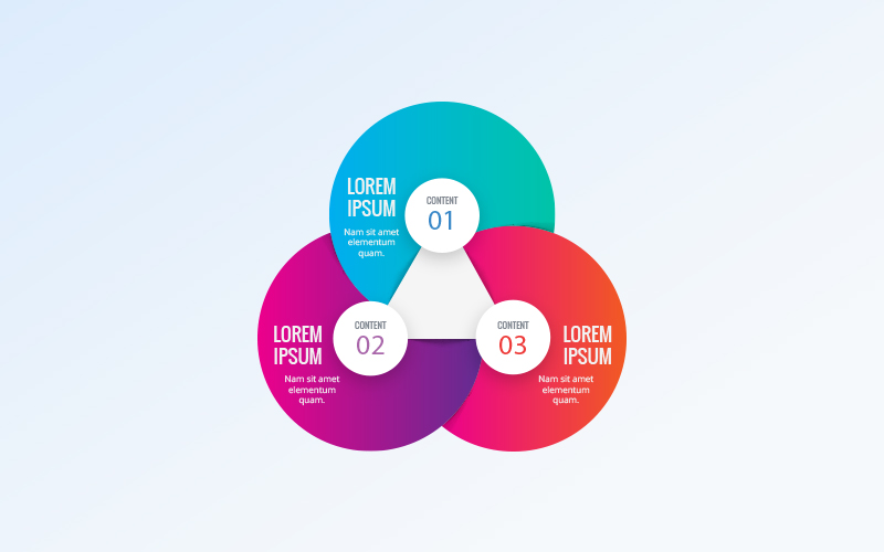
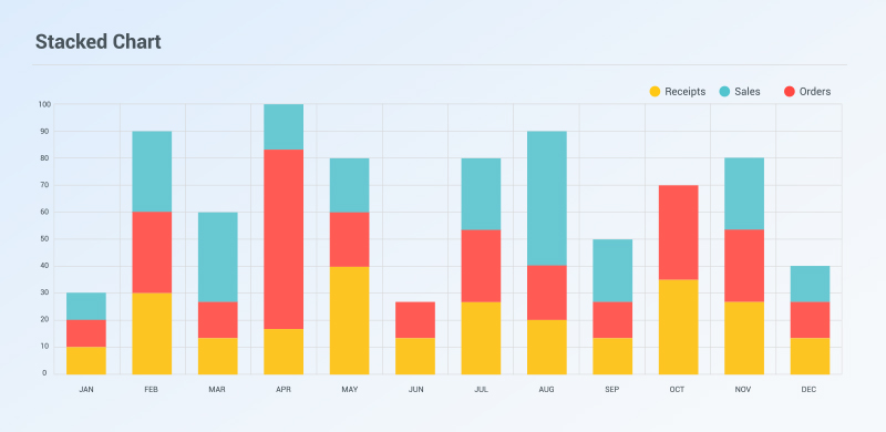
What are the images which come to your mind when you think about data visualization? You must be probably thinking about simple bar graphs or pie diagrams etc. But data visualization tool is far beyond that, and there is a whole selection of methods to present your data in a very confined and interactive way to the audience. Let us give a look
Charts
Tables
Graphs
Maps
Infographics
Wedge stack graph
Highlight table
Heat map
Histogram
Polar area
Word cloud
Bar chart
Bullet graph
Dot distribution map, etc.
If you are a marketer, then use these methods and make your data interpretation simpler and more attractive for your target audience. Many studies say that brands will be allotted 11.7% of their marketing budgets to analytics which is an increase over the current allotment of 6.4%.
So don't lose your pase in Digital Marketing, use data visualization method and enhance your productivity and increase the ease of understanding data.
How is it benefited for clients?
Everyone one is looking forward to colors and patterns, and that is the main attraction of data visualization. Imagine, you are given a spreadsheet full of data, you may be feeling bored. But how about a pie diagram or a chart which incorporates the same data which was given in a spreadsheet, that is far interesting, right? In the case of customers, data visualization helps guide them through sales funnel. As you know these tools helps to demonstrate the upside of a product or service. When you have a powerful data visualization it automatically translates into sales. It also saves your time when compared with data as such.
How are marketers using data visualization internally?
As you can see, marketers are trusting more and more on data visualization to make adjustments to campaigns. Visual analytics give an insight into how a campaign is progressing. By checking these data visualization, a marketer can understand whether their campaigns is trending or not and that too without taking much of an effort. An effective data visualization is a delicate balancing act between form and function. If you come up with a good data visualization then as a marketer you get a good story to tell the world about what you do.
Different types of visualization
What are the images which come to your mind when you think about data visualization? You must be probably thinking about simple bar graphs or pie diagrams etc. But data visualization tool is far beyond that, and there is a whole selection of methods to present your data in a very confined and interactive way to the audience. Let us give a look
Common and generally scene types of data visualization:
Charts
Tables
Graphs
Maps
Infographics
More specific types:
Wedge stack graph
Highlight table
Heat map
Histogram
Polar area
Word cloud
Bar chart
Bullet graph
Dot distribution map, etc.
If you are a marketer, then use these methods and make your data interpretation simpler and more attractive for your target audience. Many studies say that brands will be allotted 11.7% of their marketing budgets to analytics which is an increase over the current allotment of 6.4%.
So don't lose your pase in Digital Marketing, use data visualization method and enhance your productivity and increase the ease of understanding data.
